PT
-
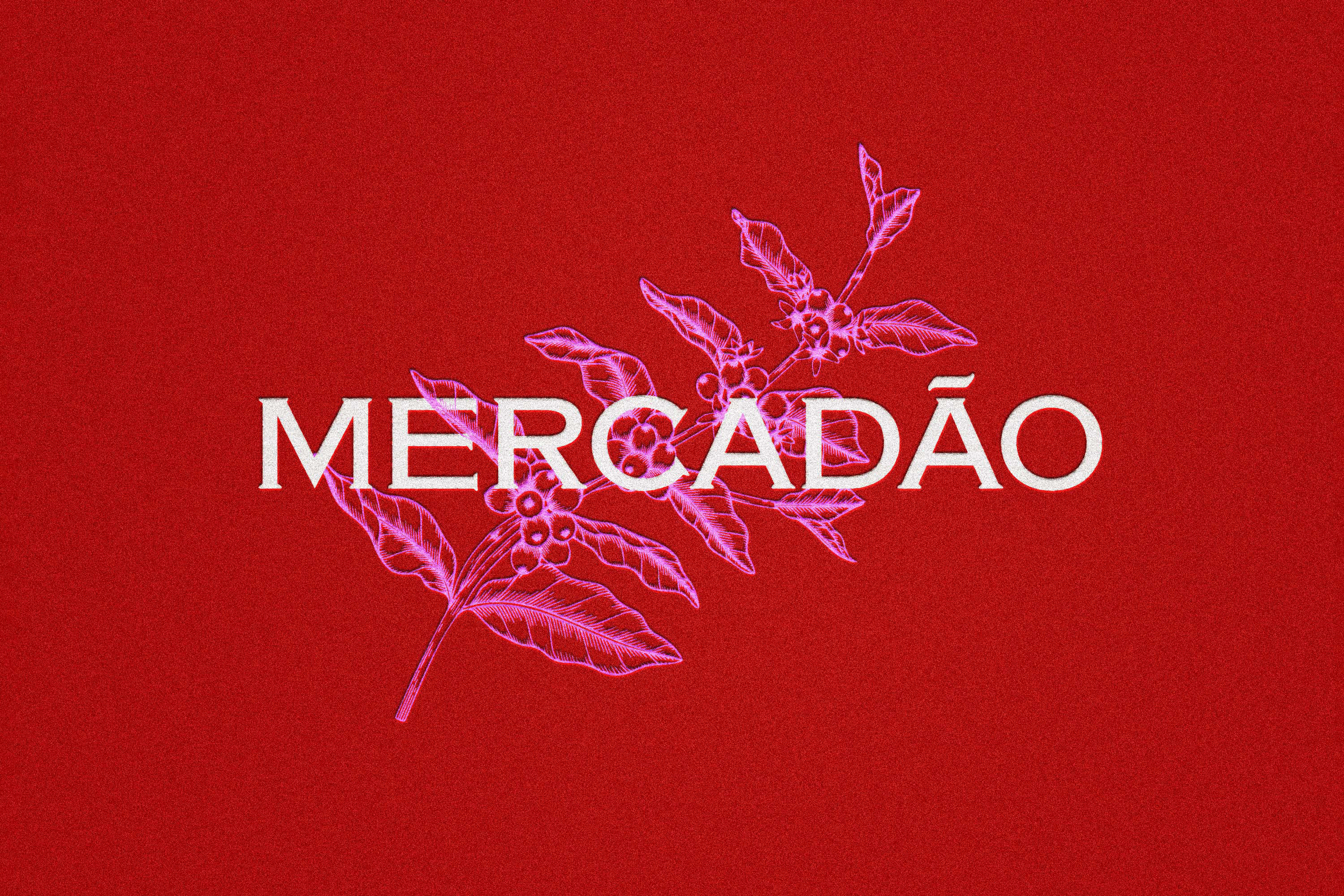
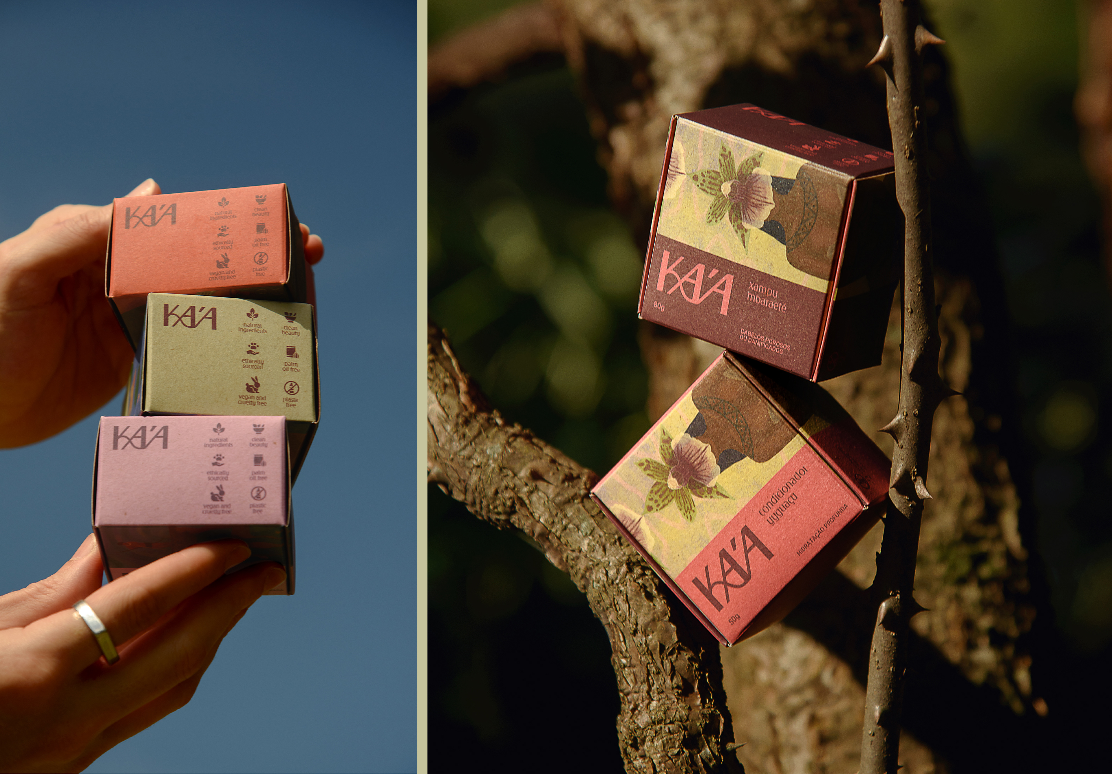
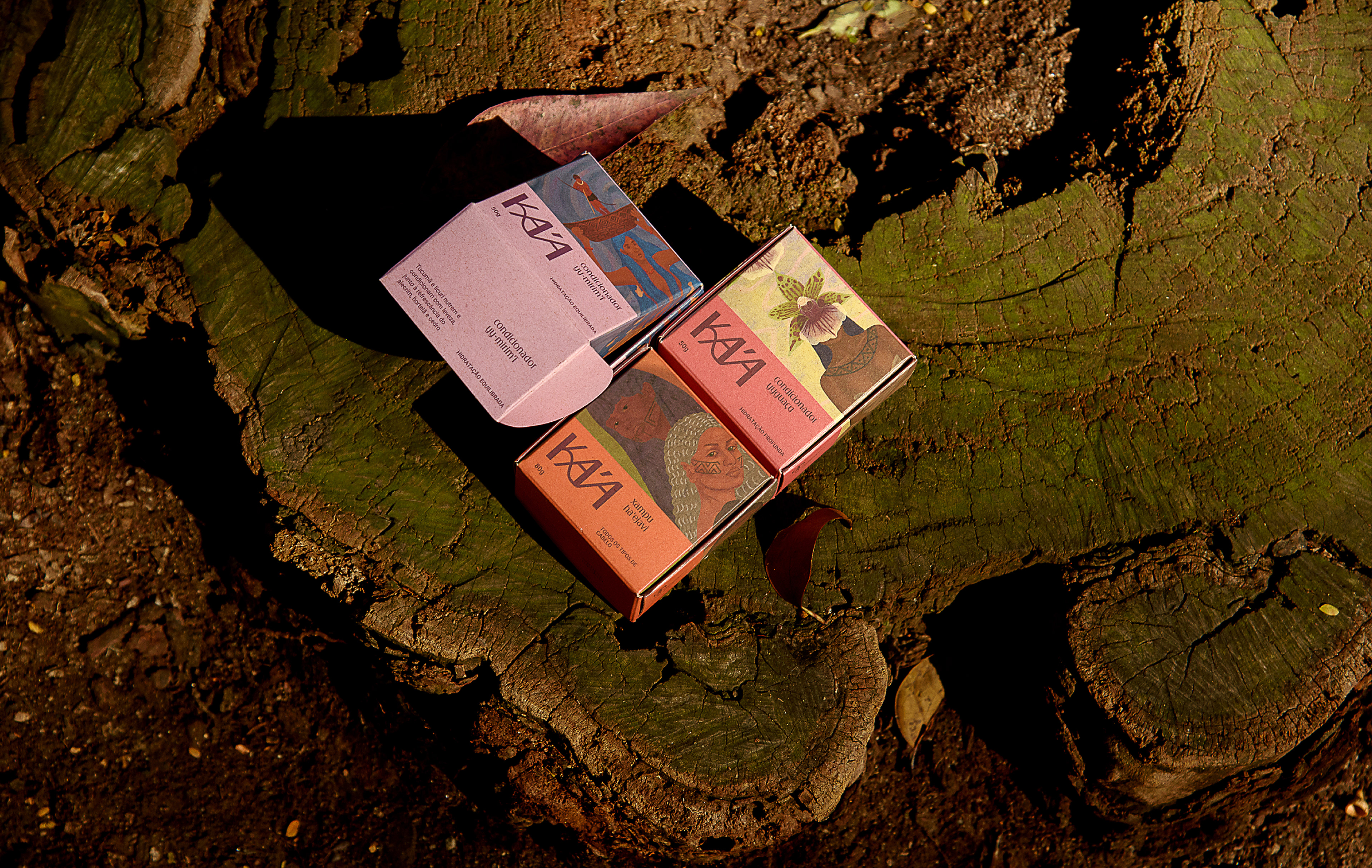
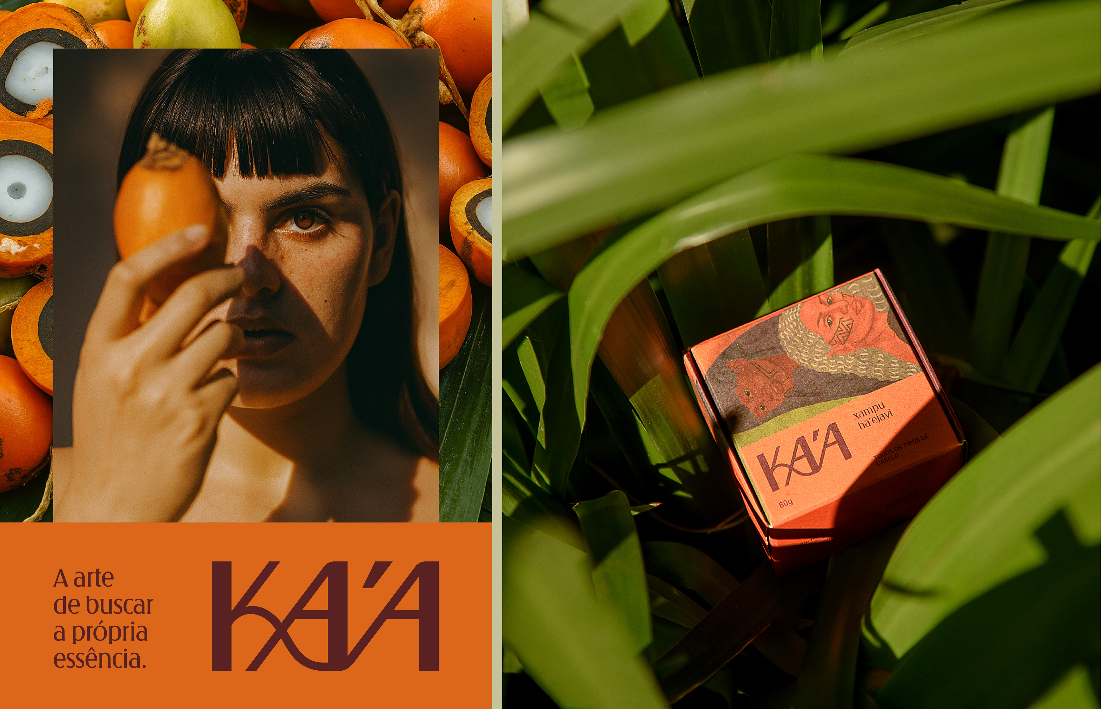
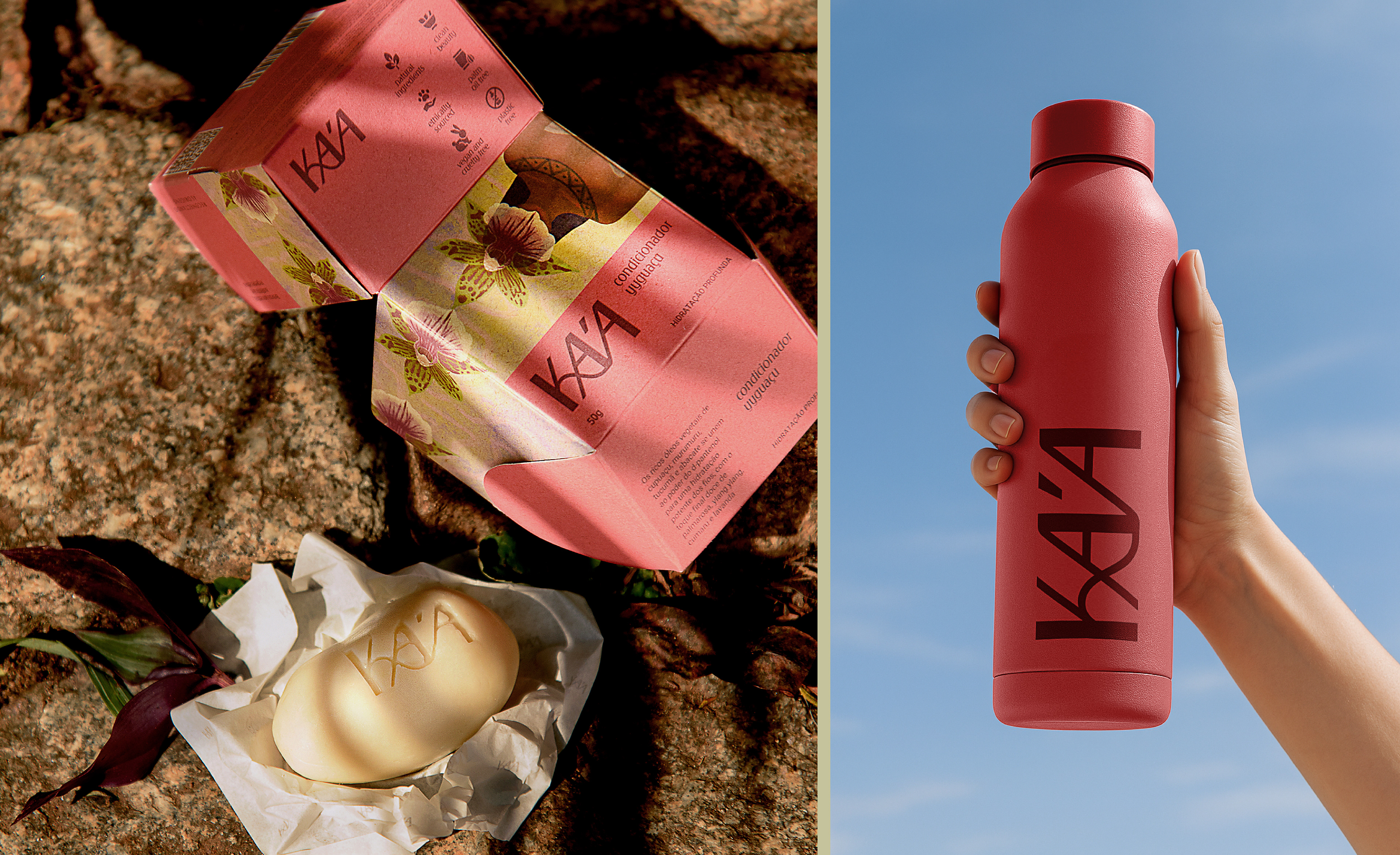
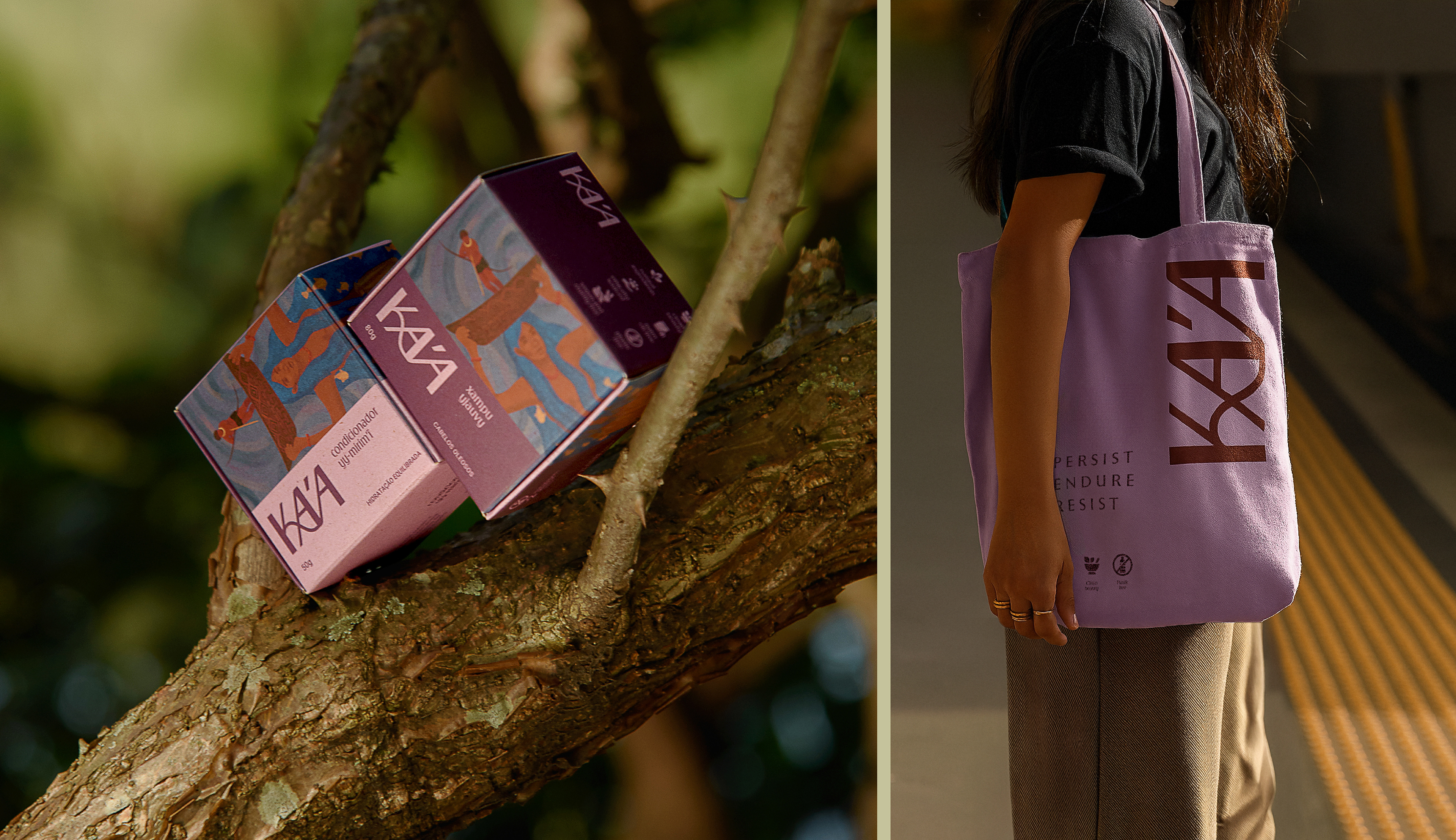
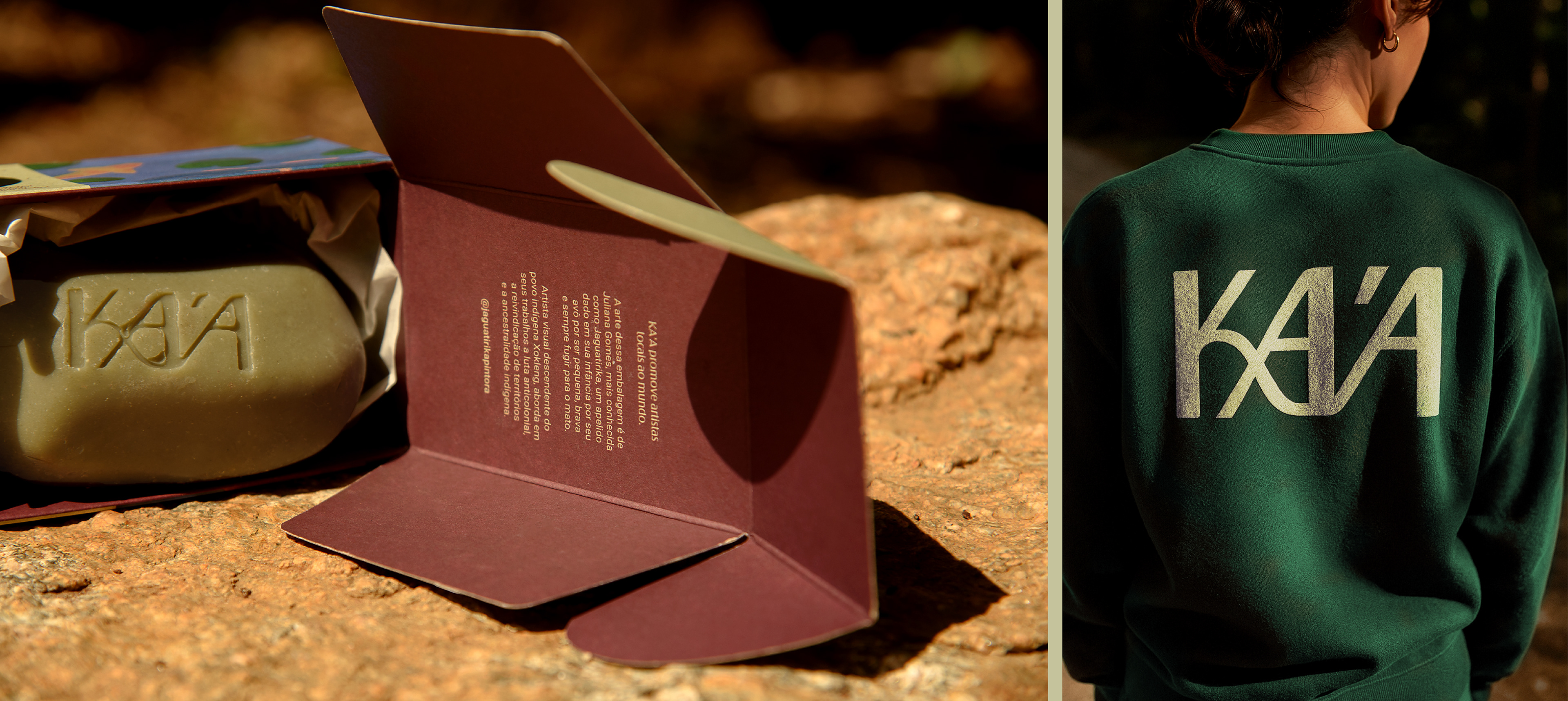
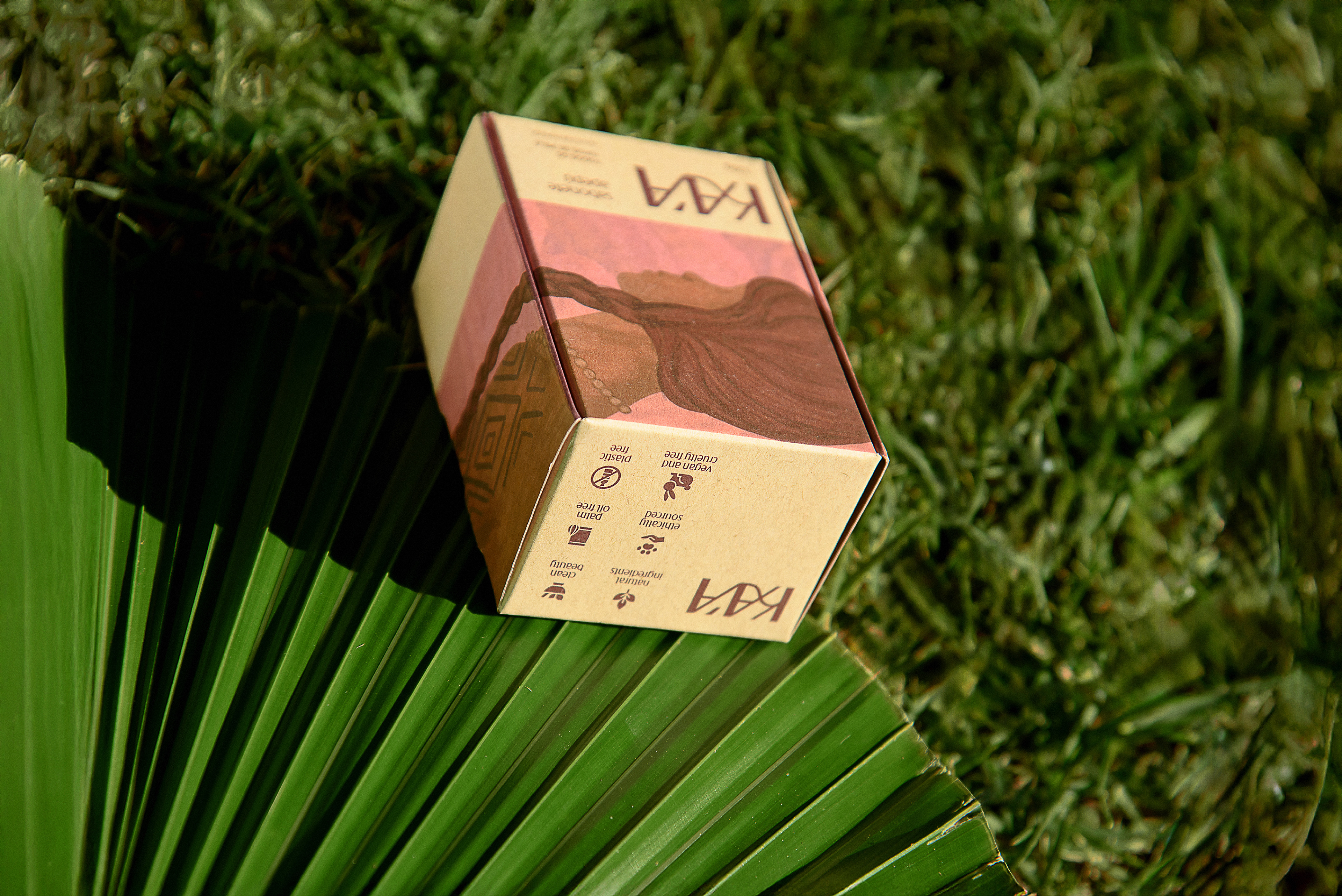
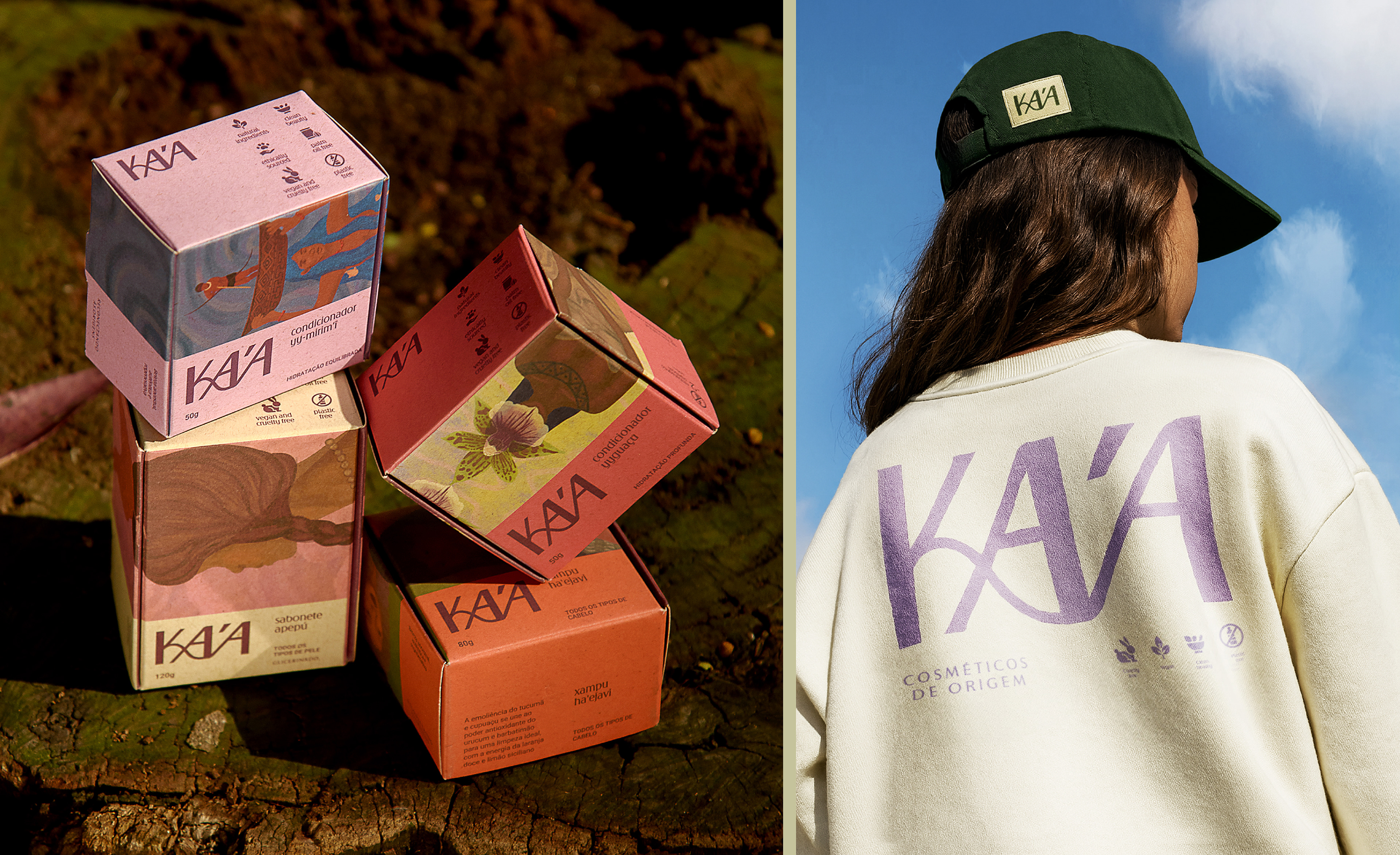
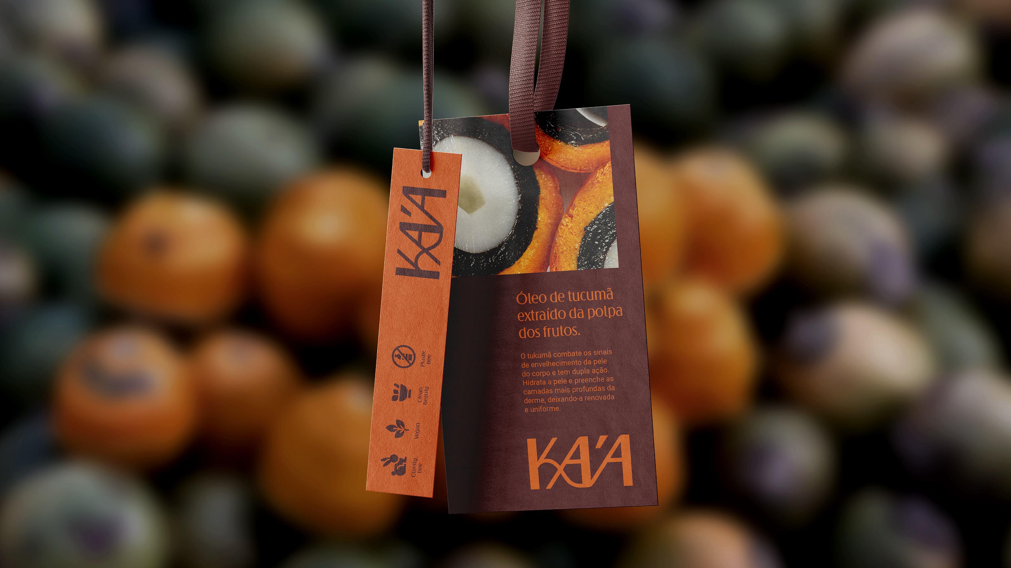
KA’A é uma marca de cosméticos em barra que valoriza os produtores, a natureza, as tradições indígenas e a riqueza dos ingredientes da Floresta Amazônica. A identidade enaltece esses ingredientes, a riqueza cultural e conhecimento ancestral, em suas cores contrastadas, formas e fotografia.
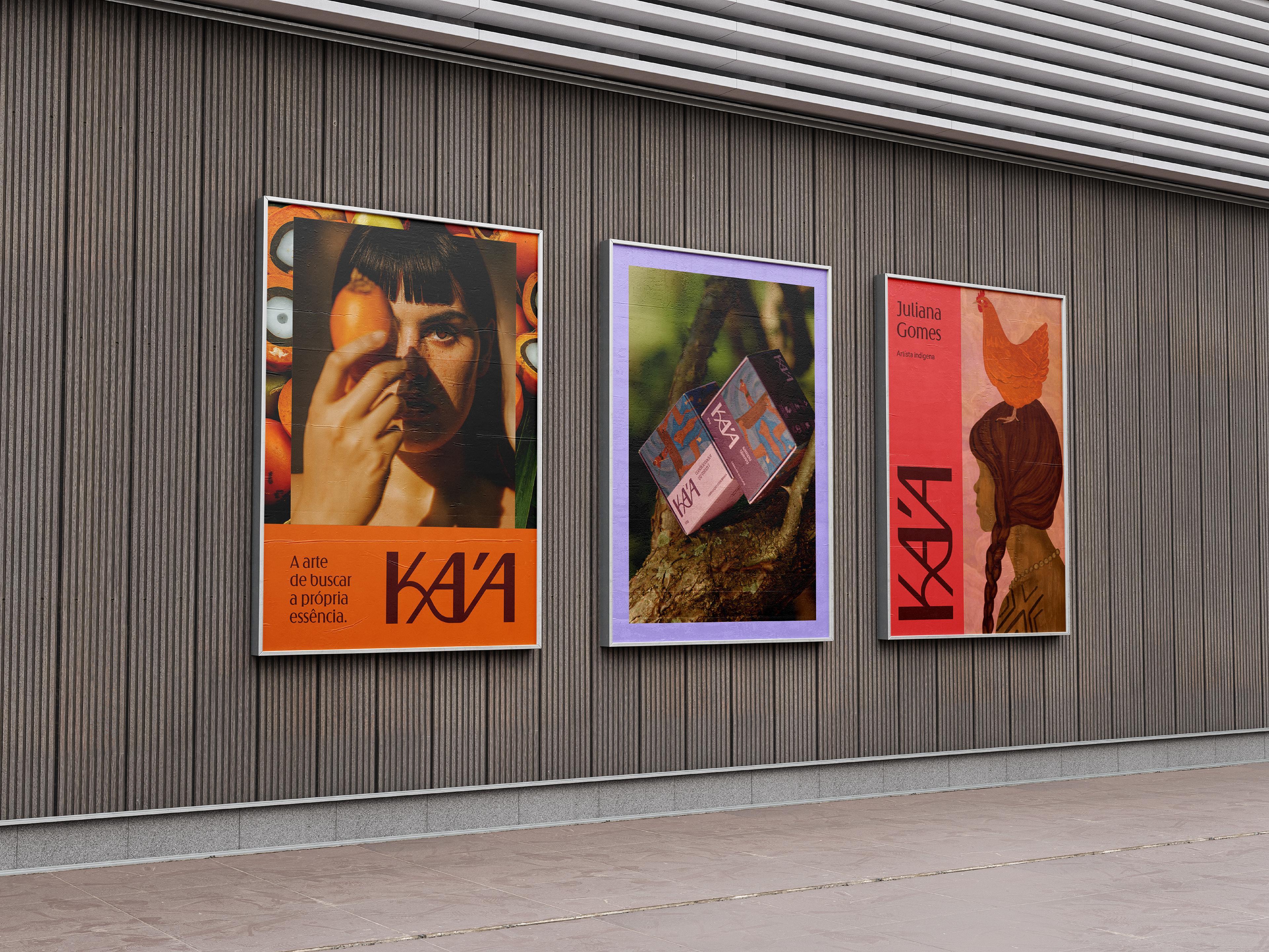
Em um segmento onde prioriza-se a leveza, poucos elementos e corres pastéis, trouxemos o maximalismo como inspiração para enfatizar os valores da marca.
Em um segmento onde prioriza-se a leveza, poucos elementos e corres pastéis, trouxemos o maximalismo como inspiração para enfatizar os valores da marca.
EN
-
KA’A is a solid cosmetics brand that values local producers, nature, Indigenous traditions, and the richness of ingredients from the Amazon rainforest. Its visual identity highlights these ingredients, cultural wealth, and ancestral knowledge through bold colors, striking forms, and photography.
In a category that often favors lightness, minimal elements, and pastel tones, we embraced maximalism as inspiration to emphasize the brand’s core values.
In a category that often favors lightness, minimal elements, and pastel tones, we embraced maximalism as inspiration to emphasize the brand’s core values.
VISUAL IDENTITY: Estúdio Ditongo
PACKAGING: Estúdio Ditongo
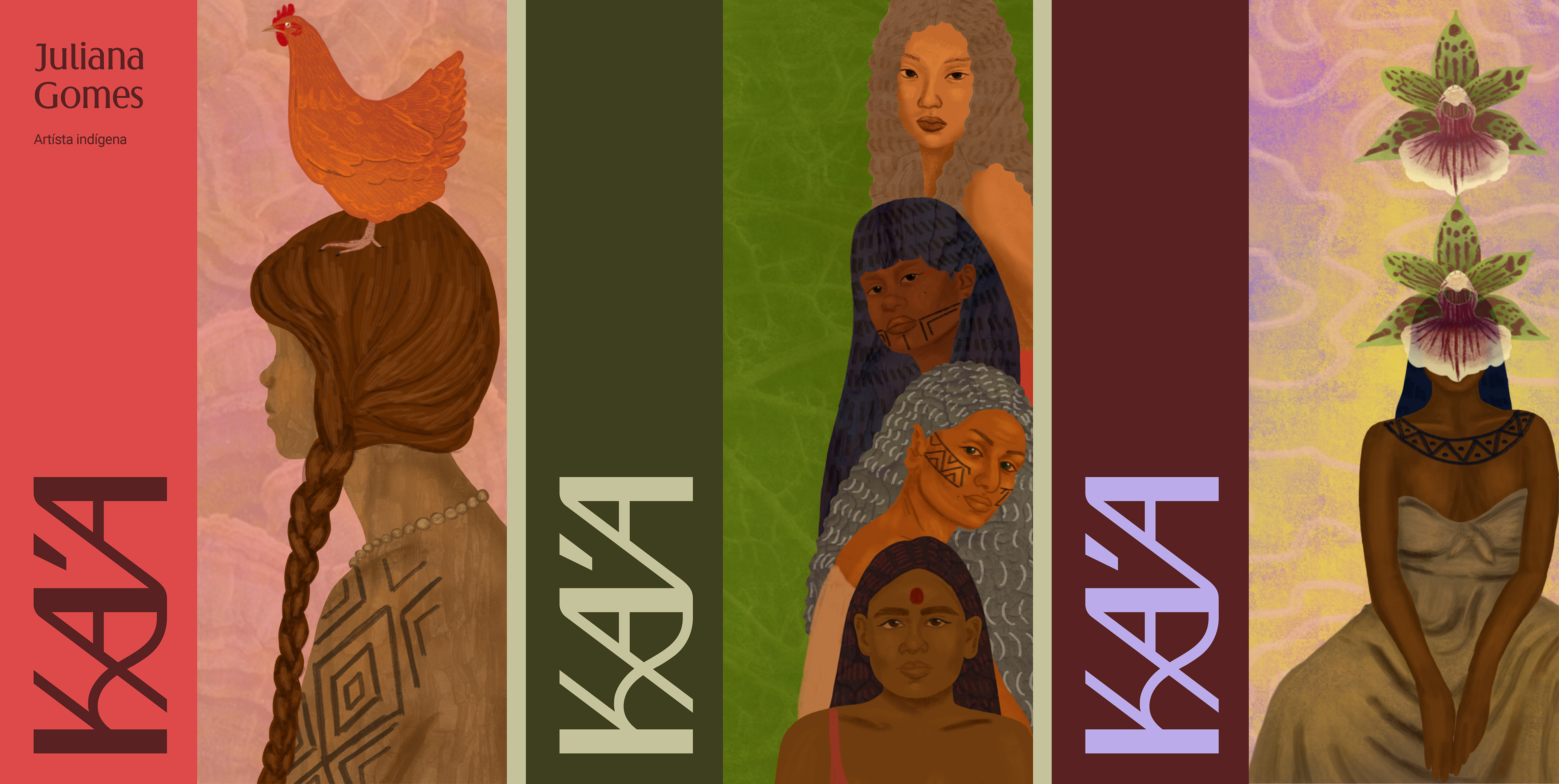
ILLUSTRATION: Jaguatirika (@abyayalese)
PHOTOGRAPHY: Bianca Ramos (@bicreative.studio)
Some additional images by the client and from Stocksy
PACKAGING: Estúdio Ditongo
ILLUSTRATION: Jaguatirika (@abyayalese)
PHOTOGRAPHY: Bianca Ramos (@bicreative.studio)
Some additional images by the client and from Stocksy


@estudioditongo
estudioditongo.com.br
estudioditongo.com.br